Chapter 19 Dashboards
I think, aesthetically, car design is so interesting - the dashboards, the steering wheels, and the beauty of the mechanics. I don’t know how any of it works, I don’t want to know, but it’s inspirational.
Paloma Picasso, designer, 2013.49
Learning objectives
Students completing this chapter will:
Understand the purpose of dashboards;
Be able to use the R package shinydashboard to create a dashboard.
The value of dashboards
A dashboard is a web page or mobile app screen designed to present important information, primarily visual format, that can be quickly and easily comprehended. Dashboards are often used to show the current status, such as the weather app you have on your smart phone. Sometimes, a dashboard can also show historical data as a means of trying to identify long term trends. Key economic indicators for the last decade or so might be shown graphically to help strategic planners identify major shifts in economic activity. In a world overflowing with data, dashboards are an information system for summarizing and presenting key data. They can be very useful for maintaining situation awareness, by providing information about key environmental measures of the current situation and possible future developments.
A dashboard typically has a header, sidebar and body
Header
There is a header across the top of a page indicating the purpose of the dashboard, and additional facts about the content, such as the creator. A search engine is a common element of a header. A header can also contain tabs to various sources of information or reports (e.g., social media or Fortune 1000 companies).
Body
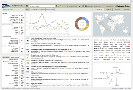
The body of a dashboard contains the information selected via a sidebar. It can contained multiple panes, as shown in the following example, that display information in a variety of ways. The body of the following dashboard contains four types of visuals (a multiple time series graph, a donut style pie chart, a map, and a relationship network). It also shows a list of documents satisfying the specified criteria and a word cloud of these documents.
I encourage you to visit the ecoresearch.net dashboard. It is an exemplar and will give you some idea of the diversity of ways in which information can be presented and the power of a dashboard to inform.
A dashboard
Designing a dashboard
The purpose of a dashboard is to communicate, so the first step is to work with the client to determine the key performance indicators (KPIs), visuals, or text that should be on the dashboard. Your client will have some ideas as to what is required, and by asking good questions and prototyping, you can clarify needs.
You will need to establish that high quality data sources are available for conversion into the required information. If data are not available, you will have to work with other IS professionals to establish them, or you might conclude that it is infeasible to try to meet some requirements. You should keep the client informed as you work through the process of resolving data source issues. Importantly, you should make the client aware of any data quality problems. Sometimes your client might have to settle for less than desirable data quality in order to get some idea of directional swings.
Try several ways of visualizing data to learn what suits the client. The ggplot2 package works well with shinydashboard, the dashboard package we will learn. Also, other R packages, such as dygraphs, can be deployed for graphing time series, a frequent dashboard element for showing trends and turning points. Where possible, use interactivity to enable the client to customize as required (e.g., let the client select the period of a time series).
Design for ease of navigation and information retrieval. Simplicity should generally be preferred to complexity. Try to get chunks of information that should be viewed at the same time on the same page, and put other collections of cohesive information on separate tabs.
Use colors consistently and in accord with general practice. For example, red is the standard color for danger, so a red information box should contain only data that indicate a key problem (e.g., a machine not working or a major drop in a KPI). Consistency in color usage can support rapid scanning of a dashboard to identify the attention demanding situations.
Study dashboards that are considered as exhibiting leading business practices or are acknowledged as exemplars. Adopt or imitate the features that work well.
Build a prototype as soon as you have a reasonable idea of what you think is required and release it to your client. This will enable the client to learn what is possible and for you to get a deeper understanding of the needs. Learn from the response to the prototype, redesign, and release version 2. Continue this process for a couple of iterations until the dashboard is accepted.
Dashboards with R
R requires two packages, shiny and shinydashboard to create a dashboard. Also, you must use RStudio to run your R script. Shiny is a R package for building interactive web applications in R. It was contributed to the R project by RStudio. It does not require knowledge of traditional web development tools such as HTML, CSS, or JavaScript. Shinydashboard uses Shiny to create dashboards, but you you don’t need to learn Shiny. Examining some examples of dashboards built with shinydashboard will give you an idea of what is feasible.
The basics
In keeping with the style of this book, we will start by creating a minimalist dashboard without any content. There are three elements: header, sidebar, and body. It this case, they are all null. Together, these three elements create the UI (user interface) of a dashboard page. The dynamic side of the page, the server, is also null. A dashboard is a Shiny app, and the final line of code runs the application.
A UI script defines the layout and appearance of dashboard’s web page. The server script contains commands to run the dashboard app and to make a page dynamic.
library(shiny)
library(shinydashboard)
header <- dashboardHeader()
sidebar <- dashboardSidebar()
body <- dashboardBody()
ui <- dashboardPage(header,sidebar,body)
server <- function(input, output) {}
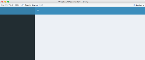
shinyApp(ui, server)When you select all the code and run it, a new browser window will open and display a blank dashboard.
When you inspect some shinydashboard code, you will sometimes see a different format in which commands are deeply embedded in other commands. The following code illustrates this approach. I suggest you avoid it because it is harder to debug such code, especially when you are a novice.
Terminating a dashboard
A dashboard is meant to be a dynamic web page that is updated when refreshed or when some element of the page is clicked on. It remains active until terminated. This means that when you want to test a new version of a dashboard or run another one, you must first stop the current one. You will need to click the stop icon on the console’s top left to terminate a dashboard and close its web page.
A header and a body
We now add some content to a basic dashboard by giving it a header and a body. This page reports the share price of Apple, which has the stock exchange symbol of AAPL. The getQuote function50 of the quantmod package returns the latest price, with about a two hour delay, every time the page is opened or refreshed. Notice the use of paste to concatenate a title and value.
library(shiny)
library(shinydashboard)
library(quantmod)
header <- dashboardHeader(title = 'Apple stock watch')
sidebar <- dashboardSidebar()
body <- dashboardBody(paste('Latest price ',getQuote('AAPL')$Last))
ui <- dashboardPage(header,sidebar,body)
server <- function(input, output) {}
shinyApp(ui, server)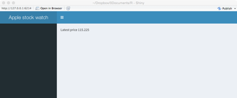
Boxes and rows
Boxes are the building blocks of a dashboard, and they can be assembled into rows or columns. The fluidRow function is used to place boxes into rows and columns. The following code illustrates the use of fluidRow.
library(shiny)
library(shinydashboard)
library(quantmod)
header <- dashboardHeader(title = 'Apple stock watch')
sidebar <- dashboardSidebar()
boxLatest <- box(title = 'Latest price: ',getQuote('AAPL')$Last, background = 'blue' )
boxChange <-  box(title = 'Change ',getQuote('AAPL')$Change, background = 'red' )
row <- fluidRow(boxLatest,boxChange)
body <- dashboardBody(row)
ui <- dashboardPage(header,sidebar,body)
server <- function(input, output) {}
shinyApp(ui, server)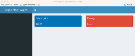
❓ Skill builder
Add three more boxes (e.g., high price) to the dashboard just created.
Multicolumn layout
Shinydashboard is based on dividing up the breadth of a web page into 12 units, assuming it is wide enough. Thus, a box with width = 6 will take up half a page. The tops of the boxes in each row will be aligned, but the bottoms may not be because of the volume of data they contain. The fluidRows function ensures that a row’s elements appear on the same line, if the browser has adequate width.
You can also specify that boxes are placed in columns. The column function defines how much horizontal space, within the 12-unit width grid, each element should occupy.
In the following code, note how:
a background for a box is defined (e.g., background=‘navy’);
five boxes are organized into two columns (rows <- fluidRow(col1,col2));
volume of shares traded is formatted with commas (formatC(getQuote(‘AAPL’)$Volume,big.mark=‘,’).
library(shiny)
library(shinydashboard)
library(quantmod)
header <- dashboardHeader(title = 'Apple stock watch')
sidebar <- dashboardSidebar()
boxLast <-  box(title = 'Latest', width=NULL, getQuote('AAPL')$Last, background='navy')
boxHigh <-  box(title = 'High', width=NULL, getQuote('AAPL')$High , background='light-blue')
boxVolume <- box(title = 'Volume', width=NULL, formatC(getQuote('AAPL')$Volume,big.mark=','), background='aqua')
boxChange <-  box(title = 'Change', width=NULL, getQuote('AAPL')$Change, background='light-blue')
boxLow <-  box(title = 'Low', width=NULL, getQuote('AAPL')$Low, background='light-blue')
col1 <-  column(width = 4,boxLast,boxHigh,boxVolume)
col2 <-  column(width = 4,boxChange,boxLow)
rows <- fluidRow(col1,col2)
body <- dashboardBody(rows)
ui <- dashboardPage(header,sidebar,body)
server <- function(input, output) {}
shinyApp(ui, server)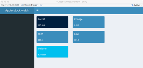
Sidebar
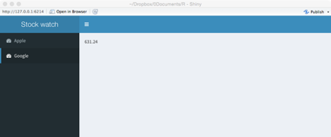
A sidebar is typically used to enable quick navigation of a dashboard’s features. It can contain layers of menus, and by clicking on a menu link or icon, the dashboard can display different content in the body area.
A library of icons is available Font-Awesome and Glyphicons for use in the creation of a dashboard.
library(shiny)
library(shinydashboard)
library(quantmod)
header <-  dashboardHeader(title = 'Stock watch')
menuApple <-  menuItem("Apple", tabName = "Apple", icon = icon("dashboard"))
menuGoogle <- menuItem("Google", tabName = "Google", icon = icon("dashboard"))
sidebar <-  dashboardSidebar(sidebarMenu(menuApple, menuGoogle))
tabApple <-  tabItem(tabName = "Apple", getQuote('AAPL')$Last)
tabGoogle <-  tabItem(tabName = "Google", getQuote('GOOG')$Last)
tabs <-  tabItems(tabApple,tabGoogle)
body <-  dashboardBody(tabs)
ui <- dashboardPage(header, sidebar, body)
server <- function(input, output) {}
shinyApp(ui, server)
For the following dashboard, by clicking on Apple, you get its latest share price, and similarly for Google.
Infobox
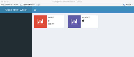
An infobox is often used to display a single measure, such as a KPI.
library(shiny)
library(shinydashboard)
library(quantmod)
header <- dashboardHeader(title = 'Apple stock watch')
sidebar <- dashboardSidebar()
infoLatest <- infoBox(title = 'Latest', icon('dollar'), getQuote('AAPL')$Last, color='red')
infoChange <- infoBox(title = 'Web site', icon('apple'),href='http://investor.apple.com', color='purple')
row <- fluidRow(width=4,infoLatest,infoChange)
body <- dashboardBody(row)
ui <- dashboardPage(header,sidebar,body)
server <- function(input, output) {}
shinyApp(ui, server))
The following dashboard shows the latest price for Apple’s shares. By clicking on the purple infobox, you access Apple investors’ web site.
Dynamic dashboards
Dashboards are more useful when they give managers access to determine what is presented. The server function supports dynamic dashboards and executes when a dashboard is opened or refreshed.
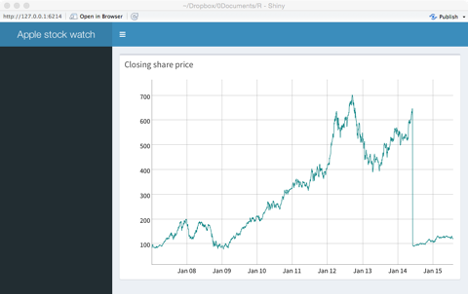
The following basic dashboard illustrates how a server function is specified and how it communicates with the user interface. Using the time series graphing package, dygraphs, it creates a dashboard showing the closing price for Apple. Key points to note:
The ui function indicates that it wants to create a graph with the code
dygraphOutput('apple').The server executes
output$apple <- renderDygraph({dygraph(Cl(get(getSymbols('AAPL'))))})to produce the graph.The linkage between the UI and the server functions is through the highlighted code, as shown in the preceding two bullets and the following code block.
The text parameter of
dynagraphOutput()in the UI function must match the text followingoutput$in the server function.The data to be graphed are retrieved with the Cl function of the quantmod package.51
library(shiny)
library(shinydashboard)
library(quantmod)
library(dygraphs) # graphic package for time series
header <-  dashboardHeader(title = 'Apple stock watch')
sidebar <- dashboardSidebar(NULL)
boxPrice <- box(title='Closing share price', width = 12, height = NULL, dygraphOutput('apple'))
body <-   dashboardBody(fluidRow(boxPrice))
ui <- dashboardPage(header, sidebar, body)
server <- function(input, output) {
# quantmod retrieves closing price as a time series
output$apple <- renderDygraph({dygraph(Cl(get(getSymbols('AAPL'))))})
}
shinyApp(ui, server)
When you create the dashboard, mouse over the points on the graph and observe the data that are reported.
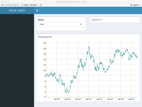
The following code illustrates how to create a dashboard that enables an analyst to graph the closing share price for Apple, Google, or Ford. Important variables in the code have been highlighted so you can easily see the correspondence between the UI and server functions. Note:
The use of a selection list to pick one of three companies (
selectInput("symbol", "Equity:", choices = c("Apple" = "AAPL", "Ford" = "F", "Google" = "GOOG"))).When an analyst selects one of the three firms, its stock exchange symbol (symbol) is passed to the server function.
The value of symbol is used to retrieve the time series for the stock and to generate the graphic (chart ) for display with
boxSymbol. The symbol is also inserted into a text string (text) for display withboxOutput.
library(shiny)
library(shinydashboard)
library(quantmod)
library(dygraphs)
header <-  dashboardHeader(title = 'Stock watch')
sidebar <- dashboardSidebar(NULL)
boxSymbol <-  box(selectInput("symbol", "Equity:", choices = c("Apple" = "AAPL",  "Ford" = "F", "Google" = "GOOG"), selected = 'AAPL'))
boxPrice <- box(title='Closing price', width = 12, height = NULL, dygraphOutput("chart"))
boxOutput <-  box(textOutput("text"))
body <-   dashboardBody(fluidRow(boxSymbol, boxOutput, boxPrice))
ui <- dashboardPage(header, sidebar, body)
server <- function(input, output) {
  output$text <- renderText({
    paste("Symbol is:",input$symbol)
  })
# Cl in quantmod retrieves closing price as a time series
output$chart <- renderDygraph({dygraph(Cl(get(input$symbol)))}) # graph time series
}
shinyApp(ui, server)
The following dashboard shows the pull down list in the top left for selecting an equity. The equity’s symbol is then displayed in the top right box, and a time series of its closing price appears in the box occupying the entire second row.
Input options
The preceding example illustrates the use of a selectInput function to select an equity from a list. There are other input options available, and these are listed in the following table.
| Function | Purpose |
|---|---|
| checkboxInput() | Check one or more boxes |
| checkboxGroupInput() | A group of checkboxes |
| numericInput() | A spin box for numeric input |
| radioButtons() | Pick one from a set of options |
| selectInput() | Select from a drop-down text box |
| selectSlider() | Select using a slider |
| textInput() | Input text |
❓ Skill builder
Using ClassicModels, build a dashboard to report total orders by value and number for a given year and month.
Conclusion
This chapter has introduced you to the basic structure and use of shinydashboard. It has many options, and you will need to consult the online documentation and examples to learn more about creating dashboards.
Summary
A dashboard is a web page or mobile app screen that is designed to present important information in an easy to comprehend and primarily visual format. A dashboard consists of a header, sidebar, and body. Shinydashboard is an R package based on shiny that facilitates the creation of interactive real-time dashboards. It must be used in conjunction with RStudio.
| Body | Sidebar |
| Header | UI function |
| Server function | User-interface (ui) |
Exercises
Create a dashboard to show the current conditions and temperatures in both Fahrenheit and Celsius at a location. Your will need the rwunderground package and an API key.
Revise the dashboard created in the prior exercise to allow someone to select from up to five cities to get the weather details for that city.
Extend the previous dashboard. If the temperature is about 30ºC (86ºF), code the server function to give both temperature boxes a red background, and if it is below 10ºC (50ºF) give both a blue background. Otherwise the color should be yellow.
Use the WDI package to access World Bank Data and create a dashboard for a country of your choosing. Show three or more of the most current measures of the state of the selected country as an information box.
Use the WDI package to access World Bank Data for China, India, and the US for three variables, (1) CO2 emissions (metric tons per capita), (2) Electric power consumption (kWh per capita), and (3) forest area (% of land area). The corresponding WDI codes are: EN.ATM.CO2E.PC, EG.USE.ELEC.KH.PC, and AG.LND.FRST.ZS. Set up a dashboard so that a person can select the country from a pull down list and then the data for that country are shown in three infoboxes.
Use the WDI package to access World Bank Data for China, India, and the US for three variables, (1) CO2 emissions (metric tons per capita), (2) Electric power consumption (kWh per capita), and (3) forest area (% of land area). The corresponding WDI codes are: EN.ATM.CO2E.PC, EG.USE.ELEC.KH.PC, and AG.LND.FRST.ZS. Set up a dashboard so that a person can select one of the three measures, and then the data for each country are shown in separate infoboxes.
Create a dashboard to:
Show the conversion rate between two currencies using the quantmod package to retrieve exchange rates. Let a person select from one of five currencies using a drop down box;
Show the value of input amount when converted one of the selected currencies to the other selected currency;
Show the exchange rate between the two selected currencies over the last 100 days
getQuote returns a dataframe, containing eight values: Trade Time, Last, Change, %Change, Open, High, Low, Volume. For example, getQuote(‘AAPL’)$
%Changereturns the percentage change in price since the daily opening price.↩︎The quantmod function getSymbols(‘X’) returns an time series object named X. The get function retrieves the name of the object and passes it to the Cl function and then the time series is graphed by dygraph. The code is a bit complicated, but necessary to generalize it for use with an interactive dashboard.↩︎